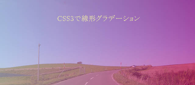
CSS3で簡単にグラデーションを作ることができるので、画像ファイルを使用しなくてよくなり、とても楽になりました。
ボタンなどに少しのグラデーションをかけることでかっこ良く見えますよね。以下に書式を示します。
backbround: linear-gradient(開始位置または角度, 開始色, 途中色, 終了色);
開始位置または角度と途中色は省略可能です。
開始位置を指定した例
sample
background: linear-gradient(to top, #000, #fff);
上から下へのグラデーション
sample
background: linear-gradient(to bottom, #000, #fff);
下から上へのグラデーション
sample
background: linear-gradient(to left, #000, #fff);
左から右へのグラデーション
sample
background: linear-gradient(to left top, #000, #fff);
左上から右下へのグラデーション
sample
background: linear-gradient(to left bottom, #000, #fff);
左下から右上へのグラデーション
sample
background: linear-gradient(to right, #000, #fff);
右から左へのグラデーション
sample
background: linear-gradient(to right top, #000, #fff);
右上から左下へのグラデーション
sample
background: linear-gradient(to right bottom, #000, #fff);
右下から左上へのグラデーション
透明度を指定した例
sample
background: linear-gradient(to right, rgba(0,0,0,0.1), #fff);
右から左へのグラデーション(透明度10%)
sample
background: linear-gradient(to right, rgba(0,0,0,0.5), #fff);
右から左へのグラデーション(透明度50%)
sample
background: linear-gradient(to right, rgba(0,0,0,0.8), #fff);
右から左へのグラデーション(透明度80%)
角度を指定した例
sample
background: linear-gradient(45deg, #000, #fff);
45度(右上から左下)へのグラデーション
sample
background: linear-gradient(-45deg, #000, #fff);
-45度(左上から右下)へのグラデーション
途中色を指定した例
sample
background: linear-gradient(to left, #000, #0f0, #fff);
左から右へのグラデーションで途中で色変更
グラデーションに対応していない古いバージョンのブラウザーのために必ず背景色を指定しましょう。
 フレックスボックスでよく使う子要素の並べ方
  見出しの下線の長さを変える方法
  メニューの余白設定 marginとpadding
  縦に中央揃えで高さの違う要素を横並びで表示
  calcを使用してflexの子要素の長さを決める方法
  ラジオボタンやチェックボックスでボタンの次に改行が入りずれてしまうのを防ぐ方法
  前:HTMLのテーブル(表)作成
 次:CSS3で円形グラデーション
コメントを残す