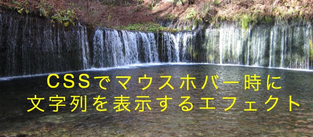
これはcssのみのマウスホバーエフェクトで、画像をマスクしてその上に文字列(キャプション)を表示します。今回は割とシンプルな動きのあるものを13種類作成しましたので書き留めておきます。
サンプル
下のサンプルをクリックすると、ソースの行にジャンプします。
1.画像をマスクして文字を表示
html
<div class="sample1">
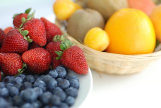
<img src="./fruit.jpg" alt="フルーツ寄せ集め" />
<div class="mask">
<div class="caption">It's fresh !</div>
</div>
</div>
css
.sample1 {
	width:			280px;
	height:			188px;
	overflow:		hidden;
	margin:			10px 8px 10px 16px;
	position:		relative;	/* 相対位置指定 */
}
.sample1 .caption {
	font-size:		130%;
	text-align: 		center;
	padding-top:		80px;
	color:			#fff;
}
.sample1 .mask {
	width:			100%;
	height:			100%;
	position:		absolute;	/* 絶対位置指定 */
	top:			0;
	left:			0;
	opacity:		0;	/* マスクを表示しない */
	background-color:	rgba(0,0,0,0.4);	/* マスクは半透明 */
	-webkit-transition:	all 0.2s ease;
	transition:		all 0.2s ease;
}
.sample1:hover .mask {
	opacity:		1;	/* マスクを表示する */
}
2.画像をマスクして上から文字がスライド
ホバー時にpaddingのtopを増やして下にスライドするように見せています。
html
<div class="sample2">
	<img src="./fruit.jpg" alt="フルーツ寄せ集め" />
	<div class="mask">
		<div class="caption">It's fresh !</div>
	</div>
</div>
css
.sample2 {
	width:			280px;
	height:			188px;
	overflow:		hidden;
	margin:			10px 8px 10px 16px;
	position:		relative;
}
.sample2 .caption {
	font-size:		130%;
	text-align: 		center;
	color:			#fff;
}
.sample2 .mask {
	width:			100%;
	height:			100%;
	position:		absolute;
	top:			0;
	left:			0;
	opacity:		0;	/* マスクを表示しない */
	background-color:	rgba(0,0,0,0.4);
	-webkit-transition:	all 0.6s ease;
	transition:		all 0.6s ease;
}
.sample2:hover .mask {
	opacity:		1;	/* マスクを表示する */
	padding-top:		80px;	/* ホバーで下にずらす */
}
3.画像をマスクして左から文字がスライド
ホバー時にpaddingのleftを増やして下にスライドするように見せています。
html
<div class="sample3">
	<img src="./fruit.jpg" alt="フルーツ寄せ集め" />
	<div class="mask">
		<div class="caption">It's fresh !</div>
	</div>
</div>
css
.sample3 {
	width:			280px;
	height:			188px;
	overflow:		hidden;
	margin:			10px 8px 10px 16px;
	position:		relative;
}
.sample3 .caption {
	font-size:		130%;
	color:			#fff;
	padding-top:		80px;
	padding-left:		0px;
}
.sample3 .mask {
	width:			100%;
	height:			100%;
	position:		absolute;
	top:			0;
	left:			0;
	opacity:		0;	/* マスクを表示しない */
	background-color:	rgba(0,0,0,0.4);
	-webkit-transition:	all 0.6s ease;
	transition:		all 0.6s ease;
}
.sample3:hover .mask {
	opacity:		1;	/* マスクを表示する */
	padding-left:		90px;	/* 右にずらす */
}
4.画像をマスクして文字が拡大
ホバー時にtransform:scaleを使用して2倍に拡大しています。
html
<div class="sample4">
	<img src="./fruit.jpg" alt="フルーツ寄せ集め" />
	<div class="mask">
		<div class="caption">It's fresh !</div>
	</div>
</div>
css
.sample4 {
	width:			280px;
	height:			188px;
	overflow:		hidden;
	margin:			10px 8px 10px 16px;
	position:		relative;
}
.sample4 .caption {
	font-size:		130%;
	text-align: 		center;
	color:			#fff;
	padding-top:		80px;
}
.sample4 .mask {
	width:			100%;
	height:			100%;
	position:		absolute;
	top:			0;
	left:			0;
	opacity:		0;	/* マスクを表示しない */
	background-color:	rgba(0,0,0,0.4);
	-webkit-transition:	all 0.4s ease-out;
	transition:		all 0.4s ease-out;
}
.sample4:hover .mask {
	opacity:		1;	/* マスクを表示する */
	-webkit-transform:	scale(2);	/* 2倍に拡大 */
	transform:		scale(2);
}
5.中心から画像をマスク
最初にtransform:scale(0)を設定して、ホバー時にtransform:scale(1)にして元の大きさに戻しています。
html
<div class="sample5">
	<img src="./fruit.jpg" alt="フルーツ寄せ集め" />
	<div class="mask">
		<div class="caption">It's fresh !</div>
	</div>
</div>
css
.sample5 {
	width:			280px;
	height:			188px;
	overflow:		hidden;
	margin:			10px 8px 10px 16px;
	position:		relative;
}
.sample5 .caption {
	font-size:		130%;
	color:			#fff;
	padding-top:		80px;
	padding-left:		100px;
}
.sample5 .mask {
	width:			100%;
	height:			100%;
	position:		absolute;
	top:			0;
	left:			0;
	background-color:	rgba(0,0,0,0.4);
	-webkit-transition:	all 0.4s ease;
	transition:		all 0.4s ease;
	-webkit-transform:	scale(0);	/* 大きさを0にして表示しない */
	transform:		scale(0);
}
.sample5:hover .mask {
	-webkit-transform:	scale(1);	/* 大きさを1にして表示する */
	transform:		scale(1);
}
6.上からスライドして画像をマスク
最初topをマイナスの値に設定して、ホバー時に0に戻しています。
html
<div class="sample6">
	<img src="./fruit.jpg" alt="フルーツ寄せ集め" />
	<div class="mask">
		<div class="caption">It's fresh !</div>
	</div>
</div>
css
.sample6 {
	width:			280px;
	height:			188px;
	overflow:		hidden;
	margin:			10px 8px 10px 16px;
	position:		relative;
}
.sample6 .caption {
	font-size:		130%;
	color:			#fff;
	padding-top:		80px;
	padding-left:		100px;
}
.sample6 .mask {
	width:			100%;
	height:			100%;
	position:		absolute;
	top:			-100%;	/* 枠の上に置いて表示させない */
	left:			0;
	background-color:	rgba(0,0,0,0.4);
	-webkit-transition:	all 0.6s ease;
	transition:		all 0.6s ease;
}
.sample6:hover .mask {
	top:			0;	/* 下に降りてくるように見せる */
}
7.縦に180度回転して画像をマスク
最初にtransform:rotateX(-180deg)で、ひっくり返しておいて、ホバー時に元に戻しています。
html
<div class="sample7">
	<img src="./fruit.jpg" alt="フルーツ寄せ集め" />
	<div class="mask">
		<div class="caption">It's fresh !</div>
	</div>
</div>
css
.sample7 {
	width:			280px;
	height:			188px;
	overflow:		hidden;
	margin:			10px 8px 10px 16px;
	position:		relative;
}
.sample7 .caption {
	font-size:		130%;
	color:			#fff;
	text-align: 		center;
	padding-top:		80px;
}
.sample7 .mask {
	width:			100%;
	height:			100%;
	position:		absolute;
	top:			0;
	left:			0;
	opacity:		0;	/* 表示させない */
	background-color:	rgba(0,0,0,0.4);
	-webkit-transform:	rotateX(-180deg);
	transform:		rotateX(-180deg);
	-webkit-transition:	all 0.6s ease;
	transition:		all 0.6s ease;
}
.sample7:hover .mask {
	-webkit-transform:	rotateX(0deg);
	transform:		rotateX(0deg);
	opacity:		1;	/* ホバーで表示する */
}
8.横に180度回転して画像をマスク
最初にtransform:rotateY(-180deg)で、ひっくり返しておいて、ホバー時に元に戻しています。
html
<div class="sample8">
	<img src="./fruit.jpg" alt="フルーツ寄せ集め" />
	<div class="mask">
		<div class="caption">It's fresh !</div>
	</div>
</div>
css
.sample8 {
	width:			280px;
	height:			188px;
	overflow:		hidden;
	margin:			10px 8px 10px 16px;
	position:		relative;
}
.sample8 .caption {
	font-size:		130%;
	color:			#fff;
	text-align: 		center;
	padding-top:		80px;
}
.sample8 .mask {
	width:			100%;
	height:			100%;
	position:		absolute;
	top:			0;
	left:			0;
	opacity:		0;	/* 表示させない */
	background-color:	rgba(0,0,0,0.4);
	-webkit-transform:	rotateY(-180deg);
	transform:		rotateY(-180deg);
	-webkit-transition:	all 0.6s ease;
	transition:		all 0.6s ease;
}
.sample8:hover .mask {
	-webkit-transform:	rotateY(0deg);
	transform:		rotateY(0deg);
	opacity:		1;	/* ホバーで表示する */
}
9.横に360度回転して画像をマスク
ホバー時にtransform:rotateY(360deg)で360度回転しています。
html
<div class="sample9">
	<img src="./fruit.jpg" alt="フルーツ寄せ集め" />
	<div class="mask">
		<div class="caption">It's fresh !</div>
	</div>
</div>
css
.sample9 {
	width:			280px;
	height:			188px;
	overflow:		hidden;
	margin:			10px 8px 10px 16px;
	position:		relative;
}
.sample9 .caption {
	font-size:		130%;
	color:			#fff;
	text-align: 		center;
	padding-top:		80px;
}
.sample9 .mask {
	width:			100%;
	height:			100%;
	position:		absolute;
	top:			0;
	left:			0;
	opacity:		0;	/* 表示させない */
	background-color:	rgba(0,0,0,0.4);
	-webkit-transition:	all 0.6s ease;
	transition:		all 0.6s ease;
}
.sample9:hover .mask {
	-webkit-transform:	rotate(360deg);
	transform:		rotate(360deg);
	opacity:		1;	/* ホバーで表示する */
}
10.上からスライドして画像を押し出す
最初にtransform:scale(1.2);で、画像を1.2倍の大きさにして、ホバー時に通常サイズに戻して、下に50ピクセルずらしています。
html
<div class="sample10">
	<img src="./fruit.jpg" alt="フルーツ寄せ集め" />
	<div class="mask">
		<div class="caption">It's fresh !</div>
	</div>
</div>
css
.sample10 {
	width:			280px;
	height:			188px;
	overflow:		hidden;
	margin:			10px 8px 10px 16px;
	position:		relative;
}
.sample10 .caption {
	font-size:		130%;
	color:			#fff;
	padding-top:		10px;
	text-align: 		center;
}
.sample10 .mask {
	width:			100%;
	height:			50px;
	position:		absolute;
	top:			-50px;	/* 枠の上に置いて表示しない */
	left:			0;
	background-color:	rgba(0,0,0,0.4);
	-webkit-transition:	all 0.4s ease;
	transition:		all 0.4s ease;
}
.sample10:hover .mask {
	top:		0px;	/* 下に降りてくるように見せる */
}
.sample10 img {
	-webkit-transition:	all 0.4s ease;
	transition:		all 0.4s ease;
	-webkit-transform:	scale(1.2);	/* 1.2倍の大きさで表示 */
	transform:		scale(1.2);
}
.sample10:hover img {
	margin-top:		50px;			/* 画像の絵を下にずらす */
	-webkit-transform:	scale(1);	/* 元の大きさに戻す */
	transform:		scale(1);
}
11.左からスライドして画像を押し出す
最初にマスクを表示させないようにして、ホバー時に左に画像半分ずらしています。
html
<div class="sample11">
	<img src="./fruit.jpg" alt="フルーツ寄せ集め" />
	<div class="mask">
		<div class="caption">It's fresh !</div>
	</div>
</div>
css
.sample11 {
	width:			280px;
	height:			188px;
	overflow:		hidden;
	margin:			10px 8px 10px 16px;
	position:		relative;
}
.sample11 .caption {
	font-size:		130%;
	color:			#fff;
	padding-top:		80px;
	padding-left:		20px;
}
.sample11 .mask {
	width:			50%;	/* 画像の半分の大きさにする */
	height:			100%;
	position:		absolute;
	top:			0;
	left:			0;
	margin-left:		-50%;	/* 枠の左に置いて表示させない */
	background-color:	rgba(0,0,0,0.4);
	-webkit-transition:	all 0.4s ease;
	transition:		all 0.4s ease;
}
.sample11:hover .mask {
	margin-left:		0px;	/* 右にずらして表示する */
}
.sample11 img {
	-webkit-transition:	all 0.4s ease;
	transition:		all 0.4s ease;
}
.sample11:hover img {
	margin-left:		50%;	/* 画像を半分サイズ、右にずらす */
}
12.上下からスライドして画像をマスク
It's fresh !
マスクを上用と下用の2つ用意します。最初に文字は表示しないようにして、マスクされた後に表示するようにしています。文字の表示は、イージングをstep-endにしています。
html
<div class="sample12">
	<img src="./fruit.jpg" alt="フルーツ寄せ集め" />
	<div class="mask1"></div>
	<div class="mask2"></div>
	<div class="caption">
		<p>It's fresh !</p>
	</div>
</div>
css
.sample12 {
	width:			280px;
	height:			188px;
	overflow:		hidden;
	margin:			10px 8px 10px 16px;
	position:		relative;
}
.sample12 .caption {
	width:			100%;
	height:			100%;
	visibility:		hidden;	/* 文字を表示しない */
	font-size:		130%;
	color:			#fff;
	top:			0;
	left:			0;
	position:		absolute;
	text-align:		center;
	-webkit-transition:	all 0.4s step-end;
	transition:		all 0.4s step-end;
}
.sample12:hover .caption {
	visibility:		visible;	/* 文字を表示する */
}
.sample12 .caption p {
	font-size:		130%;
	padding-top:		75px;
	color:			#fff;
	opacity:		0;	/* ホバーが解除された時すぐ消えるように、文字を表示しない */
}
.sample12:hover .caption p {
	opacity:		1;	/* 文字を表示する */
}
.sample12 .mask1, .sample12 .mask2 {
	width:			100%;
	height:			50%;	/* 高さは半部のサイズ */
	position:		absolute;
	left:			0;
	background-color:	rgba(0,0,0,0.4);
	-webkit-transition:	all 0.4s ease;
	transition:		all 0.4s ease;
}
.sample12 .mask1 {
	top:			-50%;	/* 枠の上に置いて表示させない */
}
.sample12:hover .mask1 {
	top:			0;	/* 下にずらして表示する */
}
.sample12 .mask2 {
	bottom:			-50%;	/* 枠の下に置いて表示させない */
}
.sample12:hover .mask2 {
	bottom:			0;	/* 上にずらして表示する */
}
13.左右からスライドして画像をマスク
マスクを左用と右用の2つ用意します。最初に文字は表示しないようにして、マスクされた後に表示するようにしています。文字の表示は、イージングをstep-endにしています。
It's fresh !
html
<div class="sample13">
	<img src="./fruit.jpg" alt="フルーツ寄せ集め" />
	<div class="mask1"></div>
	<div class="mask2"></div>
	<div class="caption">
		<p>It's fresh !</p>
	</div>
</div>
css
.sample13 {
	width:			280px;
	height:			188px;
	overflow:		hidden;
	margin:			10px 8px 10px 16px;
	position:		relative;
}
.sample13 .caption {
	width:			100%;
	height:			100%;
	visibility:		hidden;	/* 文字を表示しない */
	font-size:		130%;
	position:		absolute;
	top:			0;
	left:			0;
	text-align:		center;
	-webkit-transition:	all 0.4s step-end;
	transition:		all 0.4s step-end;
}
.sample13:hover .caption {
	visibility:		visible;	/* 文字を表示する */
}
.sample13 .caption p {
	font-size:		130%;
	padding-top:		75px;
	color:			#fff;
	opacity:		0;	/* ホバーが解除された時すぐ消えるように、文字を表示しない */
}
.sample13:hover .caption p {
	opacity:		1;	/* 文字を表示する */
}
.sample13 .mask1, .sample13 .mask2 {
	width:			50%;	/* 幅は半部のサイズ */
	height:			100%;
	position:		absolute;
	top:			0;
	background-color:	rgba(0,0,0,0.4);
	-webkit-transition:	all 0.4s ease;
	transition:		all 0.4s ease;
}
.sample13 .mask1 {
	left:			-50%;	/* 枠の左に置いて表示させない */
}
.sample13:hover .mask1 {
	left:			0px;	/* 左にずらして表示する */
}
.sample13 .mask2 {
	right:			-50%;	/* 枠の右に置いて表示させない */
}
.sample13:hover .mask2 {
	right:			0px;	/* 右にずらして表示する */
}
長いのを読んでいただき、ありがとうございます。 次は少し凝ったものを作成したいと思っています。
 見出しの下線の長さを変える方法
  メニューの余白設定 marginとpadding
  縦に中央揃えで高さの違う要素を横並びで表示
  calcを使用してflexの子要素の長さを決める方法
  ラジオボタンやチェックボックスでボタンの次に改行が入りずれてしまうのを防ぐ方法
  画像の上に透けている文字列を表示する方法
  前:WordPress4.4ではadd_theme_support('title-tag')を使用します。
 次:3DスライドショーjqueryプラグインjR3DCarouselの使い方
マウスホバーエフェクトが簡単にできるサイトを探し続けてやっとみつけられました!
cssとhtmlでできるなんて素晴らしい!!と感動して仕事中ですが書いてしまいました!
ありがとうございます!
コメントありがとうございます、お役に立てて幸いです。
スタイルをつけるときは、captionの部分につければいいんですよね?
ryu様コメントありがとうございます。
.captionの文字に修飾する場合は、その通りです。
大変参考になりました!本当にありがとうございます^^
こちらをスマホ対応にもさせる場合、どのようにすればよろしいでしょうか?
まりえ様、コメントありがとうございます。
スマホでマウスホバーに対応するには、「ontouchstart=””」を追加すれば良いです。
例えば、ページ全てにマウスホバーを有効にするときは、以下のようにbodyタグに記述します。
それぞれのタグに記述することで、有効・無効を指定できます。
お試しあれ。
自分がまさにしたかったことでしたので非常に有り難いです!
3番の左からずらすタイプのコードを参考にさせてもらって作ってたんですが、本来左にずれるホバーの影響は画像内で収まるはずが、Chromeで表示させた際、画像内で収まらずはみ出して表示されてしまいます。他のブラウザはサファリのみ確認しましたが、こちらは正常に表示されてます。このサイトもChromeで見させてもらってますので、対応していないということは考えられないと思うのですが。。。。何か対策等ございましたら教えていただけると幸いです。
りん様、コメントありがとうございます。
はみ出るということは、「overflow: hidden;」が効いていないみたいですね。
Chromeで、このページのサンプル3を見ましたがはみ出ませんでした。りん様のChromeでは、はみ出ますか?
このページのサンプルでは、はみ出ないです。
自分が作ったものは画像にカーソルを当てると、右にずらす90pxに到達するまではみ出て、到達すると正常な表示に切り替わります。
アニメーション中だけはみ出ると言うことですね。
ネットで調べると、Chromeに不具合があるみたいです。
試しに、overflow:hidden;の下に、z-index:1;を追加して試してください。
これで解決すれば良いのですが。
レスポンシブがうまく対応しません。maskは対応できたのですが、画像が大きくなってしまいスマホ版でうまく表現できません。どうしたらよいでしょうか。
koko様、コメントありがとうございます。
画像が大きくなることなので、上のコメントにあるように
overflow:hidden;の下に、z-index:1;
を追加してみてください。
マウスホバーエフェクトを探していたので、大変参考になりました!ありがとうございます。
質問なのです。リンクを貼りたいのですが、画像にしか貼ることができず、、、
マスクが全体にかかった状態だと設定したリンク先に飛べません。
12を使いたいのですが、
どこにURLを差し込めばエフェクトがかかっているままでもリンク先に飛べるのでしょうか?
すごく初歩的な質問で申し訳ないのですが、ご回答いただけると幸いです。
Marie様、コメントありがとうございます。
質問の件ですが、以下の場所に<a>タグを記述すれば良いです。
ご丁寧にありがとうございます。飛べるようになりました!
先ほど、質問がちゃんと出来ているのか分からず、
同じ名前・内容で質問を送ってしまったのですが
そちらはスルーしてください。
失礼しました。
コメント失礼します。マウスオーバーのエフェクトを探しており、とても助かりました。一つ質問なんですが、画像を左に配置し、右にはテキストを入れたいのですが、マウスオーバーのエフェクトを入れるとうまくいきません。まだまだ未熟であり、僕の能力不足であると思いますが、ご教授頂けると大変嬉しいです。
cat city様、コメントありがとうございます。
質問の件、以下に作成しましたのでご参考にしてください。
#sample {
width: 300px;
height: 200px;
overflow: hidden;
margin: 20px 10px;
position: relative;
}
#sample #text {
font-size: 130%;
color: #fff;
padding-top: 80px;
padding-left: 20px;
}
#sample #box {
width: 150px;
height: 200px;
position: absolute;
top: 0;
left: 0;
margin-left: 300px;
background-color: rgba(0,0,0,0.4);
-webkit-transition: all 0.4s ease;
transition: all 0.4s ease;
}
#sample:hover #box {
margin-left: 150px;
}
#sample img {
width: 300px;
height: 200px;
-webkit-transition: all 0.4s ease;
transition: all 0.4s ease;
}
#sample:hover img {
margin-left: -50%;
}
早速のご返信ありがとうございます。僕の説明不足でしっかり言葉のキャッチボールができていませんでした。すみません。マウスオーバーのエフェクトで出るテキストとは別に右に別のテキストを表示するというのは可能ですか?折角、作成して頂いたのに申し訳ありません。私の説明不足でした。
何か分かった様な分からない様な感じですが、以下の様に修正してください。
#sample imgのwidth: 幅を半分にします。そして右に文字を表示させるため float: left:を追加します。
マウスホバーで画像をずらさなければ、#sample:hover img{} を削除してください。
違ったらコメントください。
早急な対応ありがとうございます。
僕の伝え方が悪くてうまく伝わっていないのか、それとも伝わってはいるが、僕がcssを使いこなせていないのか(htmlとcssに出会ってまだ3日の新参者です。)
僕がやってみたいことを別のアプローチの仕方でもう一度言いなおしますと、 マウスを重ねるとテキストが表示される画像を右に配置し、左には全く無関係である文章を配置したいという事です。
isseyさんに作成して頂いたモノだと、マウスを重ねたときに表示されるはずのテキストが右側に表示されてしまいます。
図々しいようですが、早期対応していただけると嬉しいです。
長文失礼しました。
画像とテキストの配置を反対にしてしまい、すみませんでした。
HTMLとCSSを以下に記述します、ご参考にしてください。
HTML
CSS
コメント失礼します。
まさに自分がやりたいことがここに全て乗っていて感動しました。
そこで質問なのですが、マウスオーバーの設定をした写真12枚を横4、縦3で並べたいと思っています。
どのように記述すればいいのでしょうか??
uni様、コメントありがとうございます。
質問の件ですが、各画像のwidthサイズを%で指定すれば良いと思います。
横に4つならば単純に100/4=25で25%になります。
しかしマージンを含めると25%だと収まらないのでマージンに合わせてサイズを減らしていけば良いです。
お返事ありがとうございます。
現状だと画像が全て縦1列に並んでしまっている状態で、横4縦3の前に、画像を横に並べる方法を教えて頂きたいです。
横に並べる方法は、当ブログの記事、横並びのメニュー display: を使って作成を参考にしてください。
display:inline-blockかdisplay:flexを使うと良いです。私としてはinline-blockの方が簡単です。
お返事ありがとうございます。
すでにdisplay:flexを試してみたのですが、なんの変化もありませんでした。
cssのどの部分に記述すればいいのでしょうか?
初歩的な質問ばかりで申し訳ないです、、、
簡単なサンプルを作りましたのでご参考にしてください。
HTMLは、サンプルとして2つ横に並べたものです。実際には必要な数だけ追加してください。
CSSは、#boxにflexを記述します。.sample1のwidthを%にして、heightを削除します。
何度も何度もありがとうございます。
うまく動かすことができました!
本当に助かりました。ありがとうございますm(_ _”m)
大変参考になります!ありがとうございます。
PCの場合は画像にマウスホバーで動作し、
スマホの場合は画像をクリックで問題なく動作しました。
スマホの場合、マスク状態を解除するには
画像以外の別の領域をクリックすることで解除されるかと思いますが、
「画像を再度クリックして解除」させるにはどうすれば良いでしょうか??
もし可能な場合ご教授いただけると幸いです!
どうぞ宜しくお願いいたします。
中野
rui様、コメントありがとうございます。
ご質問の件ですが、私もわかりません。
他のサイトを調べましたが、他の領域を押すことでの解除しかありませんでした。
今は「画像を再度クリックして解除」することはできないみたいですね。
issey様
承知いたしました!ご返信いただきありがとうございます!
中野