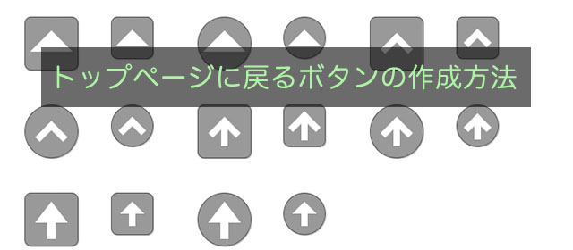
ページをスクロールするとウィンドウの右下に表示されるトップへ戻るボタンの作り方を書き留めます。CSSでサンプルボタンを作成しましたので、そのまま使用しても良し、改良しても良いです。
この記事が2016年最初の投稿になります。トップへ戻る=初心に戻るという気持ちでこの記事を書きました。これからも頑張って記事を書きたいと思っていますので、よろしくお願いいたします。
サンプル
以下のボタンをクリックすると、CSSのソースにジャンプします。
jqueryのソース
このソースは、</body>タグの前に記述します。 「show」を「fadeIn」、「hide」を「fadeOut」に変更すると緩やかに表示・非表示します。 ちなみに常時ボタンを表示する場合は、以下のソースは必要ありません。
$(function() {
	$(window).scroll(function(){
		if ($(window).scrollTop() > 100) { /* 100ライン越えると表示 */
			$("#page-top").show();
		} else {
			$("#page-top").hide();
		}
	});
	$("#page-top").click(function () {
		$("html,body").animate({scrollTop:0}, 200); /* スクロールの実行とスクロールする時間 */
	});
});
html
htmlに記述するのは以下の一行で、jqueryのソースの上あたりに記述します。 ここで紹介しているサンプルはクラス名を変えれば全て共通に使用できます。cssの「.sample1-1」などを「#page-top」に修正します。
<a id="page-top" href="#"></a>
サンプル1-1
css
.sample1-1 {
	width:		64px;
	height:		64px;
/*	right:		12px; */ /* 使用するときはコメントを外す */
/*	bottom:		12px; */ /* 使用するときはコメントを外す */
	border:		1px solid rgba(0,0,0,0.4);
	border-radius:	8px;
	box-shadow:	1px 1px 1px #ccc;
	background-color:rgba(0,0,0,0.4);
	display:	block; /* 使用数ときは none にする */
	position:	relative; /* 使用するときは fixed にする */
}
.sample1-1:after, .sample1-1:hover:after {
	content:	"";
	width:		0;
	height:		0;
	bottom:		22px;
	left:		6px;
	border:		26px solid transparent;
	position:	absolute;
}
.sample1-1:after {
	border-bottom:	26px solid #fff;
}
.sample1-1:hover:after {
	border-bottom:	26px solid #f00;
}
サンプル1-2
css
.sample1-2 {
	width:		50px;
	height:		50px;
/*	right:		12px; */ /* 使用するときはコメントを外す */
/*	bottom:		12px; */ /* 使用するときはコメントを外す */
	border:		1px solid rgba(0,0,0,0.4);
	border-radius:	8px;
	box-shadow:	1px 1px 1px #ccc;
	background-color:rgba(0,0,0,0.4);
	display:	block; /* 使用数ときは none にする */
	position:	relative; /* 使用するときは fixed にする */
}
.sample1-2:after, .sample1-2:hover:after {
	content:	"";
	width:		0;
	height:		0;
	bottom:		15px;
	left:		5px;
	border:		20px solid transparent;
	position:	absolute;
}
.sample1-2:after {
	border-bottom:	20px solid #fff;
}
.sample1-2:hover:after {
	border-bottom:	20px solid #f00;
}
サンプル2-1
css
.sample2-1 {
	width:		64px;
	height:		64px;
/*	right:		12px; */ /* 使用するときはコメントを外す */
/*	bottom:		12px; */ /* 使用するときはコメントを外す */
	border:		1px solid rgba(0,0,0,0.4);
	box-shadow:	1px 1px 1px #ccc;
	border-radius:	50%;
	background-color:rgba(0,0,0,0.4);
	display:	block; /* 使用数ときは none にする */
	position:	relative; /* 使用するときは fixed にする */
}
.sample2-1:after, .sample2-1:hover:after {
	content:	"";
	width:		0;
	height:		0;
	bottom:		22px;
	left:		6px;
	border:		26px solid transparent;
	position:	absolute;
}
.sample2-1:after {
	border-bottom:	26px solid #fff;
}
.sample2-1:hover:after {
	border-bottom:	26px solid #f00;
}
サンプル2-2
css
.sample2-2 {
	width:		50px;
	height:		50px;
/*	right:		12px; */ /* 使用するときはコメントを外す */
/*	bottom:		12px; */ /* 使用するときはコメントを外す */
	border:		1px solid rgba(0,0,0,0.4);
	border-radius:	50%;
	box-shadow:	1px 1px 1px #ccc;
	background-color:rgba(0,0,0,0.4);
	display:	block; /* 使用数ときは none にする */
	position:	relative; /* 使用するときは fixed にする */
}
.sample2-2:after, .sample2-2:hover:after {
	content:	"";
	width:		0;
	height:		0;
	bottom:		15px;
	left:		5px;
	border:		20px solid transparent;
	position:	absolute;
}
.sample2-2:after {
	border-bottom:	20px solid #fff;
}
.sample2-2:hover:after {
	border-bottom:	20px solid #f00;
}
サンプル3-1
css
.sample3-1 {
	width:		64px;
	height:		64px;
/*	right:		12px; */ /* 使用するときはコメントを外す */
/*	bottom:		12px; */ /* 使用するときはコメントを外す */
	border:		1px solid rgba(0,0,0,0.4);
	box-shadow:	1px 1px 1px #ccc;
	border-radius:	8px;
	background-color:rgba(0,0,0,0.4);
	display:	block; /* 使用数ときは none にする */
	position:	relative; /* 使用するときは fixed にする */
}
.sample3-1:after, .sample3-1:hover:after {
	content:	"";
	width:		20px;
	height:		20px;
	top:		25px;
	left:		18px;
	transform:	rotate(-45deg);
	position:	absolute;
}
.sample3-1:after {
	border-top:	8px solid #fff;
	border-right:	8px solid #fff;
}
.sample3-1:hover:after {
	border-top:	8px solid #f00;
	border-right:	8px solid #f00;
}
サンプル3-2
css
.sample3-2 {
	width:		50px;
	height:		50px;
/*	right:		12px; */ /* 使用するときはコメントを外す */
/*	bottom:		12px; */ /* 使用するときはコメントを外す */
	border:		1px solid rgba(0,0,0,0.4);
	box-shadow:	1px 1px 1px #ccc;
	border-radius:	8px;
	background-color:rgba(0,0,0,0.4);
	display:	block; /* 使用数ときは none にする */
	position:	relative; /* 使用するときは fixed にする */
}
.sample3-2:after, .sample3-2:hover:after {
	content:	"";
	width:		16px;
	height:		16px;
	top:		19px;
	left:		13px;
	transform:	rotate(-45deg);
	position:	absolute;
}
.sample3-2:after {
	border-top:	8px solid #fff;
	border-right:	8px solid #fff;
}
.sample3-2:hover:after {
	border-top:	8px solid #f00;
	border-right:	8px solid #f00;
}
サンプル4-1
css
.sample4-1 {
	width:		64px;
	height:		64px;
/*	right:		12px; */ /* 使用するときはコメントを外す */
/*	bottom:		12px; */ /* 使用するときはコメントを外す */
	border:		1px solid rgba(0,0,0,0.4);
	box-shadow:	1px 1px 1px #ccc;
	border-radius:	50%;
	background-color:rgba(0,0,0,0.4);
	display:	block; /* 使用数ときは none にする */
	position:	relative; /* 使用するときは fixed にする */
}
.sample4-1:after, .sample4-1:hover:after {
	content:	"";
	width:		20px;
	height:		20px;
	top:		25px;
	left:		18px;
	transform:	rotate(-45deg);
	position:	absolute;
}
.sample4-1:after {
	border-top:	8px solid #fff;
	border-right:	8px solid #fff;
}
.sample4-1:hover:after {
	border-top:	8px solid #f00;
	border-right:	8px solid #f00;
}
サンプル4-2
css
.sample4-2 {
	width:		50px;
	height:		50px;
/*	right:		12px; */ /* 使用するときはコメントを外す */
/*	bottom:		12px; */ /* 使用するときはコメントを外す */
	border:		1px solid rgba(0,0,0,0.4);
	box-shadow:	1px 1px 1px #ccc;
	border-radius:	50%;
	background-color:rgba(0,0,0,0.4);
	display:	block; /* 使用数ときは none にする */
	position:	relative; /* 使用するときは fixed にする */
}
.sample4-2:after, .sample4-2:hover:after {
	content:	"";
	width:		16px;
	height:		16px;
	top:		19px;
	left:		13px;
	transform:	rotate(-45deg);
	position:	absolute;
}
.sample4-2:after {
	border-top:	8px solid #fff;
	border-right:	8px solid #fff;
}
.sample4-2:hover:after {
	border-top:	8px solid #f00;
	border-right:	8px solid #f00;
}
サンプル5-1
css
.sample5-1 {
	width:		64px;
	height:		64px;
/*	right:		12px; */ /* 使用するときはコメントを外す */
/*	bottom:		12px; */ /* 使用するときはコメントを外す */
	border:		1px solid rgba(0,0,0,0.4);
	box-shadow:	1px 1px 1px #ccc;
	border-radius:	8px;
	background-color:rgba(0,0,0,0.4);
	display:	block; /* 使用数ときは none にする */
	position:	relative; /* 使用するときは fixed にする */
}
.sample5-1:after {
	content:	"";
	width:		20px;
	height:		20px;
	top:		20px;
	left:		18px;
	transform:	rotate(-45deg);
	position:	absolute;
}
.sample5-1:after {
	border-top:	8px solid #fff;
	border-right:	8px solid #fff;
}
.sample5-1:hover:after {
	border-top:	8px solid #f00;
	border-right:	8px solid #f00;
}
.sample5-1:before {
	content:	"";
	width:		32px;
	height:		32px;
	top:		18px;
	left:		28px;
	position:	absolute;
	border-left:	8px solid #fff;
}
.sample5-1:hover:before {
	border-left:	8px solid #f00;
}
サンプル5-2
css
.sample5-2 {
	width:		50px;
	height:		50px;
/*	right:		12px; */ /* 使用するときはコメントを外す */
/*	bottom:		12px; */ /* 使用するときはコメントを外す */
	border:		1px solid rgba(0,0,0,0.4);
	box-shadow:	1px 1px 1px #ccc;
	border-radius:	8px;
	background-color:rgba(0,0,0,0.4);
	display:	block; /* 使用数ときは none にする */
	position:	relative; /* 使用するときは fixed にする */
}
.sample5-2:after {
	content:	"";
	width:		20px;
	height:		20px;
	top:		13px;
	left:		11px;
	transform:	rotate(-45deg);
	position:	absolute;
}
.sample5-2:after {
	border-top:	8px solid #fff;
	border-right:	8px solid #fff;
}
.sample5-2:hover:after {
	border-top:	8px solid #f00;
	border-right:	8px solid #f00;
}
.sample5-2:before {
	content:	"";
	width:		30px;
	height:		28px;
	top:		15px;
	left:		21px;
	position:	absolute;
	border-left:	8px solid #fff;
}
.sample5-2:hover:before {
	border-left:	8px solid #f00;
}
サンプル6-1
css
.sample6-1 {
	width:		64px;
	height:		64px;
/*	right:		12px; */ /* 使用するときはコメントを外す */
/*	bottom:		12px; */ /* 使用するときはコメントを外す */
	border:		1px solid rgba(0,0,0,0.4);
	box-shadow:	1px 1px 1px #ccc;
	border-radius:	50%;
	background-color:rgba(0,0,0,0.4);
	display:	block; /* 使用数ときは none にする */
	position:	relative; /* 使用するときは fixed にする */
}
.sample6-1:after {
	content:	"";
	width:		20px;
	height:		20px;
	top:		20px;
	left:		18px;
	transform:	rotate(-45deg);
	position:	absolute;
}
.sample6-1:after {
	border-top:	8px solid #fff;
	border-right:	8px solid #fff;
}
.sample6-1:hover:after {
	border-top:	8px solid #f00;
	border-right:	8px solid #f00;
}
.sample6-1:before {
	content:	"";
	width:		32px;
	height:		32px;
	top:		18px;
	left:		28px;
	position:	absolute;
	border-left:	8px solid #fff;
}
.sample6-1:hover:before {
	border-left:	8px solid #f00;
}
サンプル6-2
css
.sample6-2 {
	width:		50px;
	height:		50px;
/*	right:		12px; */ /* 使用するときはコメントを外す */
/*	bottom:		12px; */ /* 使用するときはコメントを外す */
	border:		1px solid rgba(0,0,0,0.4);
	box-shadow:	1px 1px 1px #ccc;
	border-radius:	50%;
	background-color:rgba(0,0,0,0.4);
	display:	block; /* 使用数ときは none にする */
	position:	relative; /* 使用するときは fixed にする */
}
.sample6-2:after {
	content:	"";
	width:		16px;
	height:		16px;
	top:		15px;
	left:		13px;
	transform:	rotate(-45deg);
	position:	absolute;
}
.sample6-2:after {
	border-top:	8px solid #fff;
	border-right:	8px solid #fff;
}
.sample6-2:hover:after {
	border-top:	8px solid #f00;
	border-right:	8px solid #f00;
}
.sample6-2:before {
	content:	"";
	width:		15px;
	height:		23px;
	top:		19px;
	left:		21px;
	position:	absolute;
	border-left:	8px solid #fff;
}
.sample6-2:hover:before {
	border-left:	8px solid #f00;
}
サンプル7-1
css
.sample7-1 {
	width:		64px;
	height:		64px;
/*	right:		12px; */ /* 使用するときはコメントを外す */
/*	bottom:		12px; */ /* 使用するときはコメントを外す */
	border:		1px solid rgba(0,0,0,0.4);
	border-radius:	8px;
	box-shadow:	1px 1px 1px #ccc;
	background-color:rgba(0,0,0,0.4);
	display:	block; /* 使用数ときは none にする */
	position:	relative; /* 使用するときは fixed にする */
}
.sample7-1:after, .sample7-1:hover:after {
	content:	"";
	width:		0;
	height:		0;
	bottom:		28px;
	left:		12px;
	border:		20px solid transparent;
	position:	absolute;
}
.sample7-1:after {
	border-bottom:	26px solid #fff;
}
.sample7-1:hover:after {
	border-bottom:	26px solid #f00;
}
.sample7-1:before {
	content:	"";
	width:		20px;
	height:		20px;
	bottom:		8px;
	left:		27px;
	position:	absolute;
	border-left:	10px solid #fff;
}
.sample7-1:hover:before {
	border-left:	10px solid #f00;
}
サンプル7-2
css
.sample7-2 {
	width:		50px;
	height:		50px;
/*	right:		12px; */ /* 使用するときはコメントを外す */
/*	bottom:		12px; */ /* 使用するときはコメントを外す */
	border:		1px solid rgba(0,0,0,0.4);
	border-radius:	8px;
	box-shadow:	1px 1px 1px #ccc;
	background-color:rgba(0,0,0,0.4);
	display:	block; /* 使用数ときは none にする */
	position:	relative; /* 使用するときは fixed にする */
}
.sample7-2:after, .sample7-2:hover:after {
	content:	"";
	width:		0;
	height:		0;
	bottom:		25px;
	left:		10px;
	border:		15px solid transparent;
	position:	absolute;
}
.sample7-2:after {
	border-bottom:	15px solid #fff;
}
.sample7-2:hover:after {
	border-bottom:	15px solid #f00;
}
.sample7-2:before {
	content:	"";
	width:		15px;
	height:		15px;
	bottom:		10px;
	left:		21px;
	position:	absolute;
	border-left:	8px solid #fff;
}
.sample7-2:hover:before {
	border-left:	8px solid #f00;
}
サンプル8-1
css
.sample8-1 {
	width:		64px;
	height:		64px;
/*	right:		12px; */ /* 使用するときはコメントを外す */
/*	bottom:		12px; */ /* 使用するときはコメントを外す */
	border:				1px solid rgba(0,0,0,0.4);
	border-radius:	50%;
	box-shadow:	1px 1px 1px #ccc;
	background-color:rgba(0,0,0,0.4);
	display:	block; /* 使用数ときは none にする */
	position:	relative; /* 使用するときは fixed にする */
}
.sample8-1:after, .sample8-1:hover:after {
	content:	"";
	width:		0;
	height:		0;
	bottom:		28px;
	left:		12px;
	border:		20px solid transparent;
	position:	absolute;
}
.sample8-1:after {
	border-bottom:	26px solid #fff;
}
.sample8-1:hover:after {
	border-bottom:	26px solid #f00;
}
.sample8-1:before {
	content:	"";
	width:		20px;
	height:		20px;
	bottom:		8px;
	left:		27px;
	position:	absolute;
	border-left:	10px solid #fff;
}
.sample8-1:hover:before {
	border-left:	10px solid #f00;
}
サンプル8-2
css
.sample8-2 {
	width:		50px;
	height:		50px;
/*	right:		12px; */ /* 使用するときはコメントを外す */
/*	bottom:		12px; */ /* 使用するときはコメントを外す */
	border:		1px solid rgba(0,0,0,0.4);
	border-radius:	50%;
	box-shadow:	1px 1px 1px #ccc;
	background-color:rgba(0,0,0,0.4);
	display:	block; /* 使用数ときは none にする */
	position:	relative; /* 使用するときは fixed にする */
}
.sample8-2:after, .sample8-2:hover:after {
	content:	"";
	width:		0;
	height:		0;
	bottom:		25px;
	left:		10px;
	border:		15px solid transparent;
	position:	absolute;
}
.sample8-2:after {
	border-bottom:	15px solid #fff;
}
.sample8-2:hover:after {
	border-bottom:	15px solid #f00;
}
.sample8-2:before {
	content:	"";
	width:		15px;
	height:		15px;
	bottom:		10px;
	left:		21px;
	position:	absolute;
	border-left:	8px solid #fff;
}
.sample8-2:hover:before {
	border-left:	8px solid #f00;
}
 フレックスボックスでよく使う子要素の並べ方
  見出しの下線の長さを変える方法
  メニューの余白設定 marginとpadding
  縦に中央揃えで高さの違う要素を横並びで表示
  calcを使用してflexの子要素の長さを決める方法
  ラジオボタンやチェックボックスでボタンの次に改行が入りずれてしまうのを防ぐ方法
  前:WordPressのサイドバーにアイキャッチ画像付きで最近の投稿を表示する方法
 次:CSSでラジオボタンの大きさを変える方法
コメントを残す